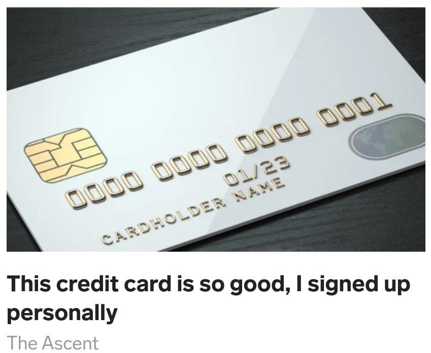
This teaser is so good, I clicked to see what the author signed up for.

What’s cool about this
I’ve been looking at how financial products are marketed recently. I’ve been clicking almost every finance-related advertisement I can find. I’ve seen the good, the bad, and the ugly in terms of creatives and landing pages. Now, I am going to share my findings so you don’t have to burn the midnight oil looking at over-optimized funnels for stock tip newsletters and credit cards. This article is going to mark the first in a series of articles about teasers that drive clicks to finance-related offers.
This teaser was developed under a separate brand called “The Ascent” by the Motley Fool. This services describes itself as a “money concierge” that shows you different products “that can make your money work harder for you”. Basically, it’s an affiliate marketing program for different financial services.
Let’s talk about the teaser. Out of 20 or so other advertisements on the article I was supposed to be reading, I clicked this one because I was curious to see what credit card the author actually signed up for.
The photo is intriguing because it shows an unbranded credit card. The viewer has no idea what sort of card it could be. It invokes a sort of blank check sort of feeling. There could be limitless possibilities for this credit card.
This title was really unique in that it used first person. It quickly establishes a personal connection. Credit card comparison sites are generally boring and anonymous and this brief phrase overcomes a bit of that preconceived notion. It fits with the brand of The Ascent because they promote themselves as a personal connection that helps you with financial products. Their brand is reinforced even from the first interaction.
About this creative
Category: Banking and Finance
Company: The Motley Fool
Company URL: https://www.fool.com/the-ascent/
Advertising Format: Native
Advertising Network: Dianomi
Country: United States

