Kamala Harris Fundraising Email by the DGA with Unique Layout

What’s cool about this
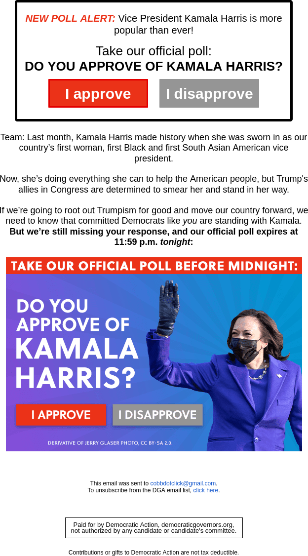
Today’s blog post features a Democratic Party fundraising email disguised as a survey to gauge support of Kamala Harris. This email was sent to me by the Democratic Governors Association and offers an interesting format designed to elicit donations from supporters.
This email breaks the mold of conventional email marketing through its structure. The conventional email features a hero image to grab attention followed by body text and a call to action at the end. This email is different because it features the call to action at the top where the hero image should be. This hero image is where the call to action would normally be.
I would like to point out that the hero image also features a call to action in the form of two visual buttons. The image also creates urgency requiring that the reader take action before midnight. It’s a very well-crafted creative. Sometimes, visuals like this might run the risk of optimization and discourage people from clicking on them. I do not think that’s the case with this creative because the call to action at the top will drive people to click on the hero image.
Possibly overlooked but equally important is the copy in this email. The author uses very vivid imagery to appeal to potential donors and stays on message.
About this creative
Category: Political
Organization: Democratic Governors Association
Organization URL: https://democraticgovernors.org/
Advertising Format: Email
Country: United States

